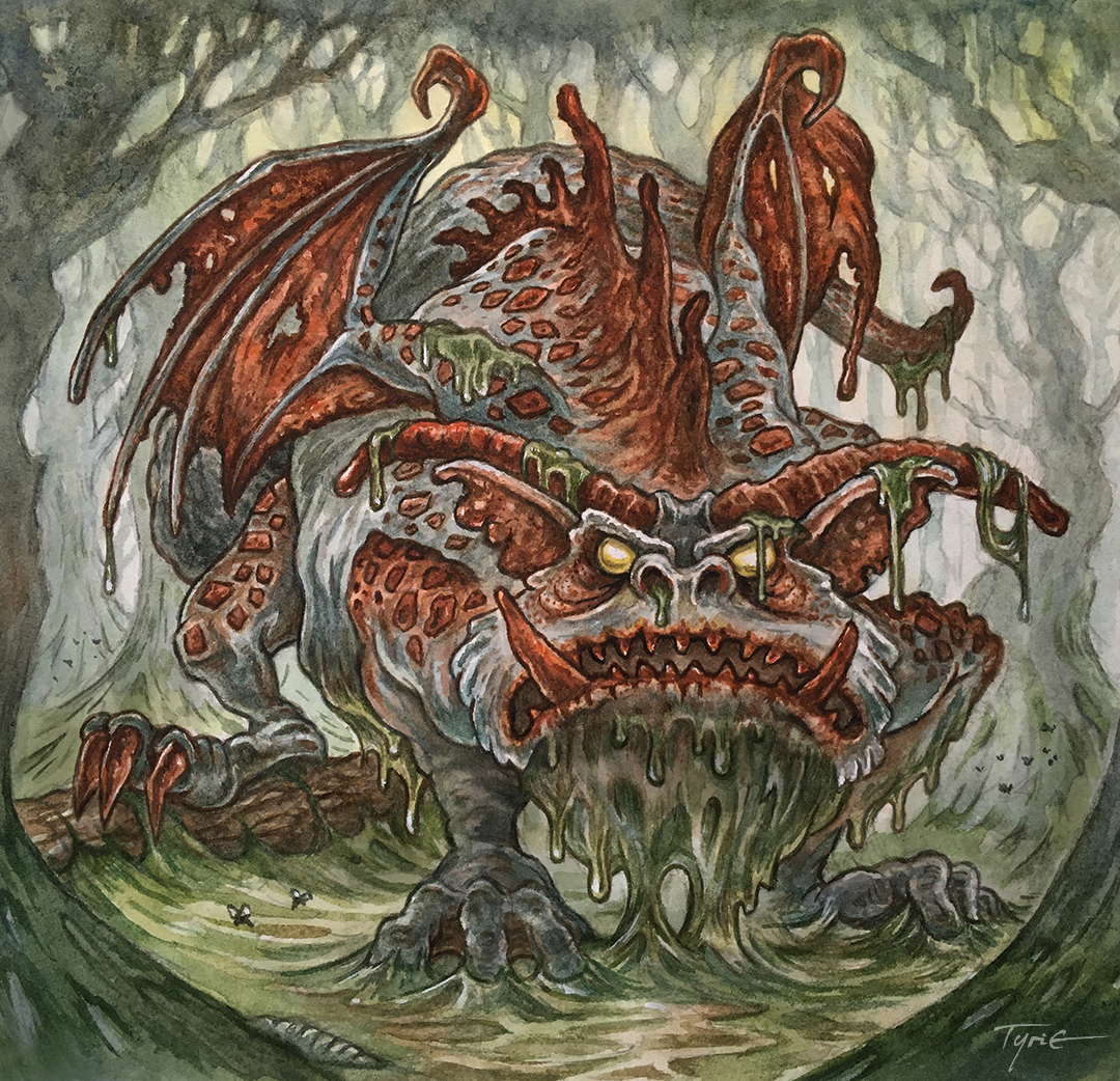
Here is my finished colored Dragon. And below are my steps to create it as well as the community submissions.

This month the prompt was two words: Cosmic & Jellyfish
I opened several tabs of google image searches of Jellyfish, the Cosmos, and a few images drawn by Nate Pride: Blight Drone 001 & 'The Darkness Consumes All'

So, I did a lighbox draw over on a clean sheet of copy paper to formalize those elements (seen here after scanning in a purple/magenta tone).

I printed out the above design and taped that onto the back of a sheet of Strathmore 300 series bristol. Using a lightpad, I was able to see through the surface of the bristol as I inked the dragon. I used Copic Multiliner 0.7 pen to ink the art.
The inking on this piece was all about managing those black areas that make the creature look transparent while also conveying that it is made up of galaxies. The Jellyfish bell and tendrils were something I tried to use a different texture for and practice more restraint with. I was unable to finish the inks on-stream, but returned to them later that night off-stream.

Then it was time to start the color flatting process––basically professional coloring-in-the-lines. Some of this is just to make it easy to re-isolate various parts when doing later painting & rendering. I went with a medium blue (darker than in my rough) for the base body, and a similar purple for the Bell & tendrils. For the spots on the bell, I used a very pale yellow as a contrast to the violets.
For the final colors I used a paintbrush to give some subtle color transitions in the body before using the dodge and burn tools to create the highlights and shadows. Each little star and planet and moon had to be carefully gone over with the dodge tool to make it brighter and a appear to shine inside this dragon's body. To make the bell seem more cosmic I painted white stipples all over it like a field of stars.
Below you can again see the final Dragon...